This tab used to customize visual settings for the bracket display.
Using the Customization tab one can modify the following sections:
Style
Styles define the general look and feel of the widget across all pages.
To change Style set up the following options:

- Colors, including:
- Header background
- Body background
- Accent color
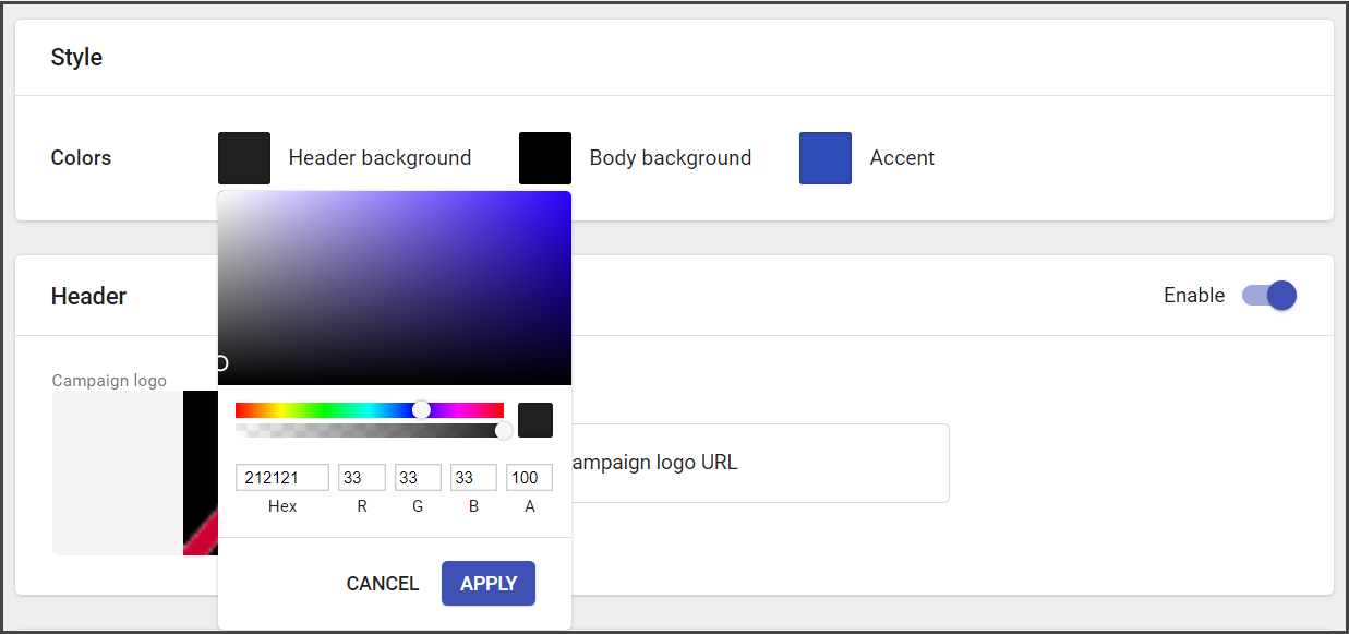
Note: Colors can be added by choosing the needed one from the spectrum or added via HEX or code. Additionally, you can adjust transparency.
Header
The header is the heading part of the campaign, that contains general information about the campaign and its logo.
This section is optional. It may be enabled or disabled.
To modify the Header do the following:
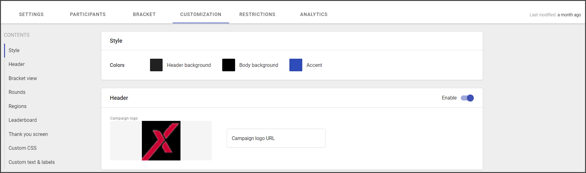
- Add a campaign logo (upload or use URL). Recommended size: 228x112
- Include the campaign headline (campaign name).
- Specify sub-headline (brief campaign description or additional info for end-users).
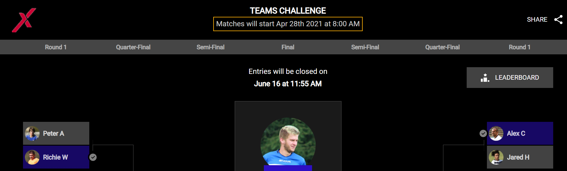
See header display for the end-user at the picture below:
- Campaign logo
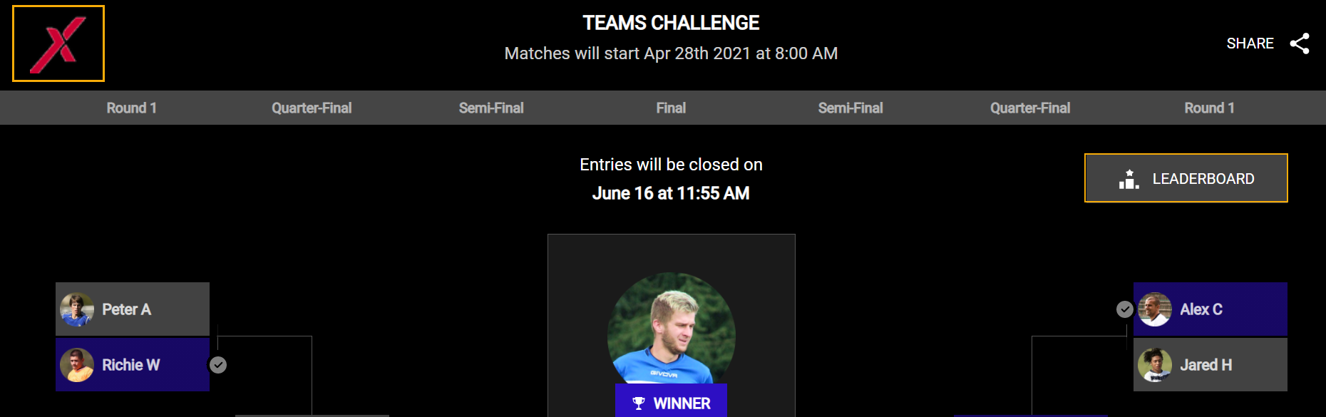
- Campaign headline
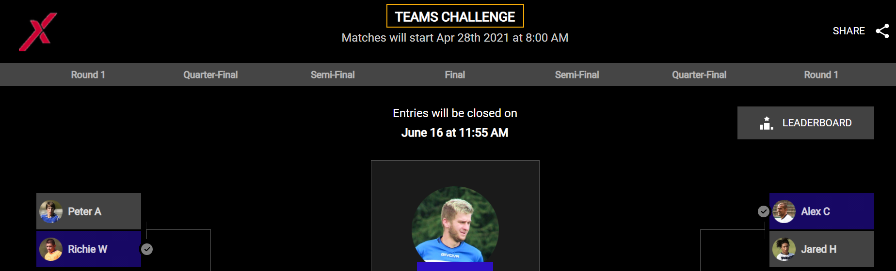
- Campaign sub-headline
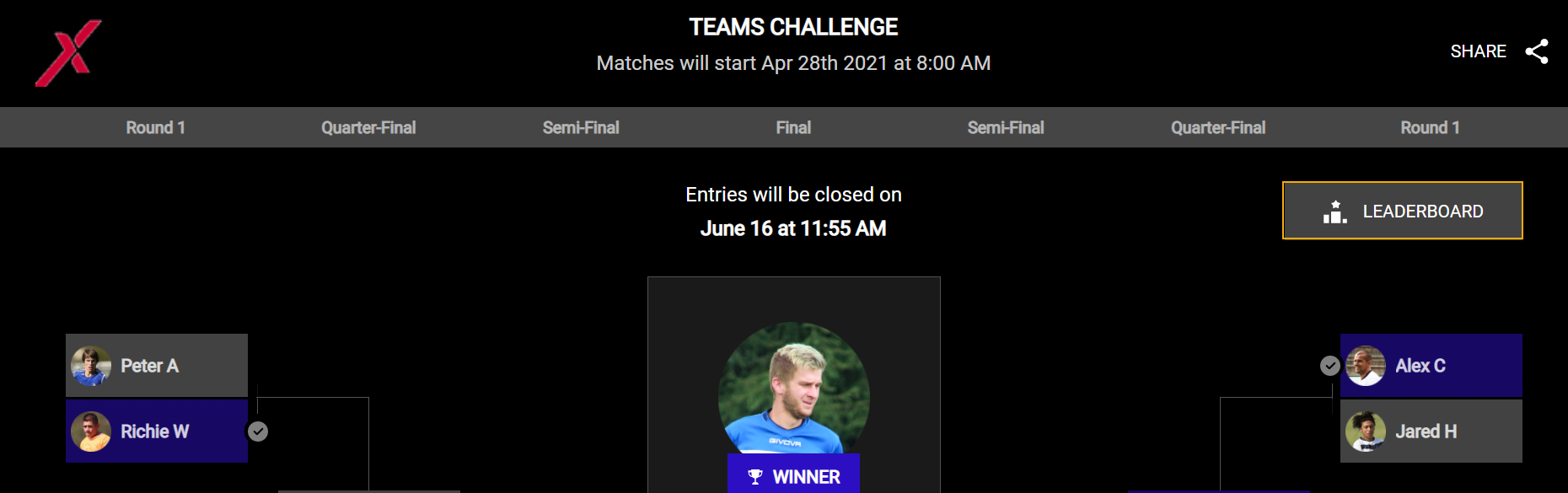
Bracket View
The Bracket view identifies the bracket display. Its optional setup, that is used to customize the backgrounds for the bracket on different devices, regions, and promo images.
The Bracket view options include:
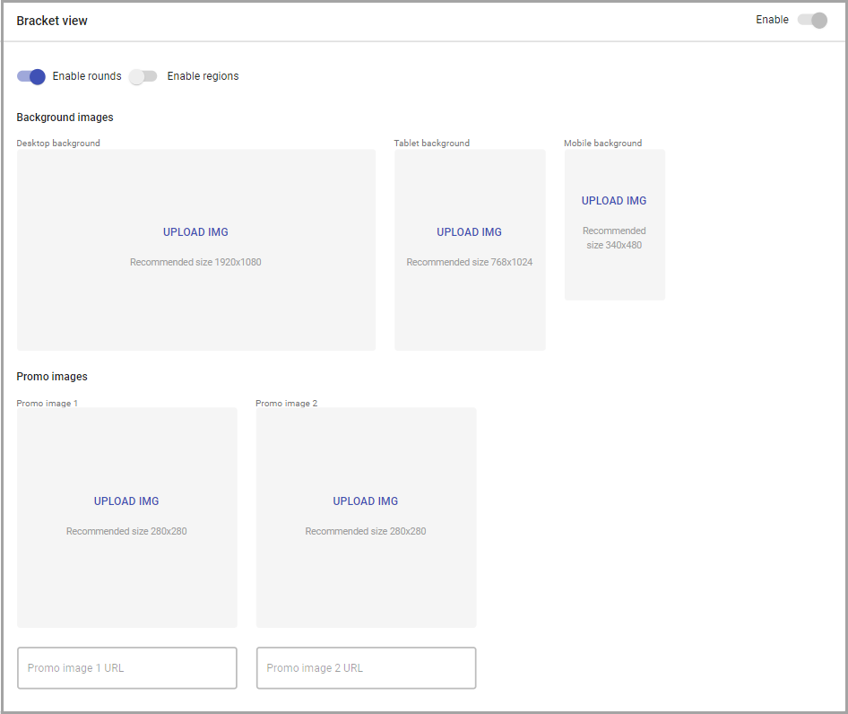
- Enabling/disabling rounds (round name appears near every corresponding matchup).
- Enabling/disabling regions.
- Adding custom background images for different backgrounds:
- Desktop (recommended size: 1920x1080)
- Tablet (recommended size: 768x1024)
- Mobile (recommended size: 340x480)
- Adding promo images and their URLs.
Recommended size: 280x280.
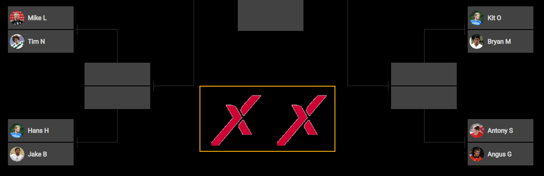
See the Promo image display for the end-user at the image below:
Rounds
Customize round names if you want to apply specific naming.
The number of rounds depends on bracket size:
- 4 for 16
- 5 for 32
- 6 for 64
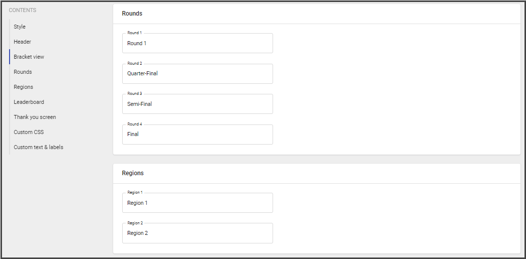
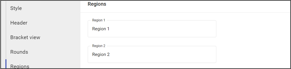
Regions
The Regions section is used to specify the name of the group participants belong to.
Add the name for each of them, if necessary.
By default region name corresponds to the field name.
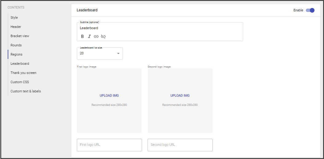
Leaderboard
The Leaderboard contains the list of winners according to the collected predictions.
Note: The Leaderboard is available on the widget only in Entries Active or Entries Closed state.
The Pending campaign widget has no leaderboard.
To customize the Leaderboard:
- Add subtitle.
- Specify the Leaderboard list size (from 1 to 99).
- Add logo images and URLs.
To open the Leaderboard at the widget:
- Click Leaderboard.
2. Review the available results.
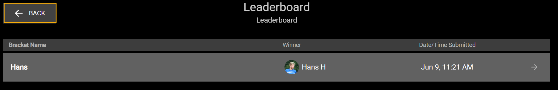
3. Click Back to return to the widget.
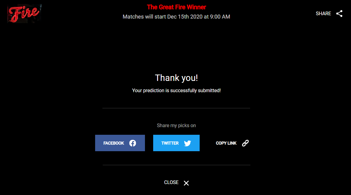
Thank You Screen
Thank you screen appears after the user submitted picks.
Thank you screen contains the following components:
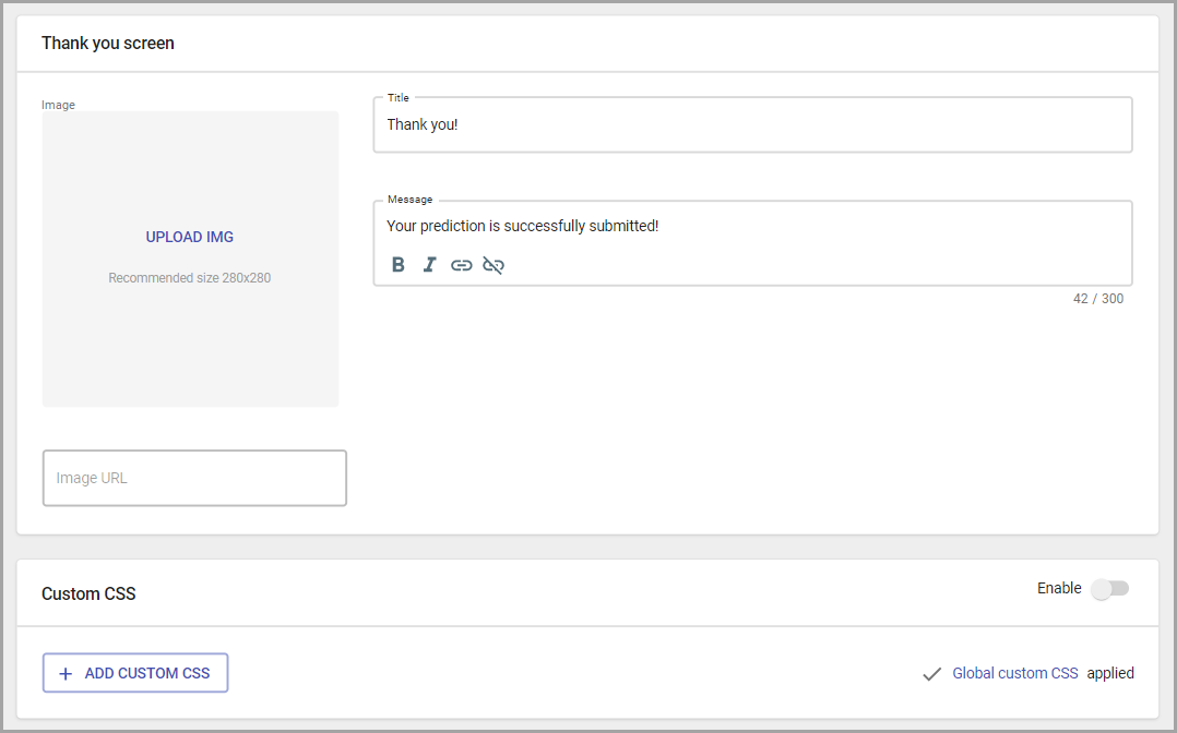
- Image (recommended size: 280x280)
- Title (default value is: Thank you).
- Description (default value is: Your prediction was successfully submitted).
The end-user thank you screen also contains sharing options.
Custom CSS, text and labels
Custom CSS - the page section for adding the custom CSS.
It's optional and provides the flexibility of very granular customization by redefining the widget CSS.
To add custom CSS do the following:
- Go to the Custom CSS section.
- Click on Add Custom CSS button.

- Add title.
- Copy the CSS parameters and paste them to the Custom CSS section.
- Save changes.
Custom text & labels
Currently, custom text and labels settings help to customize the wording for text and labels that appears on the widget UI. To add it to your widget, contact Support.
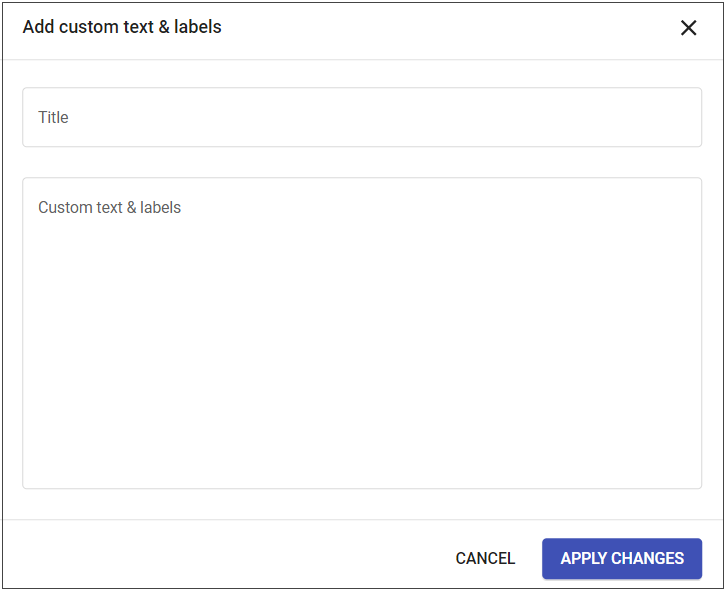
The JSON code with custom text and labels will be added to your campaign and you will be able to edit it.
To edit the custom text and labels:
- Go to Custom text & labels.
- Choose added custom text & labels.
- Edit the needed code section.
- Apply changes.